Brand and Logo Design
Blending nature and design to create a scalable and responsive logo and brand identity inspired by the unique traits of an animal and a company’s purpose.
Starting with a Sketch
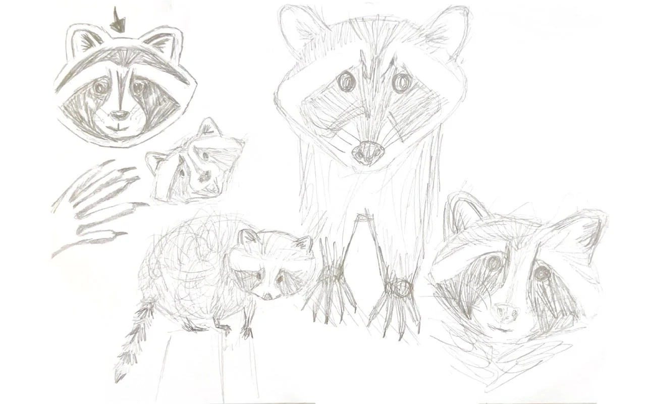
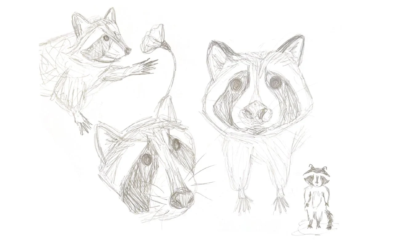
For this project, I set out to transform a random pairing—a raccoon and a tech startup—into a cohesive and compelling brand. My first step was a deep dive into understanding the raccoon’s form and features through pencil sketches. This exploration helped me identify key elements—like its distinctive mask and black nose—that would later inspire the foundation of the logo design.
Digitizing and iterating
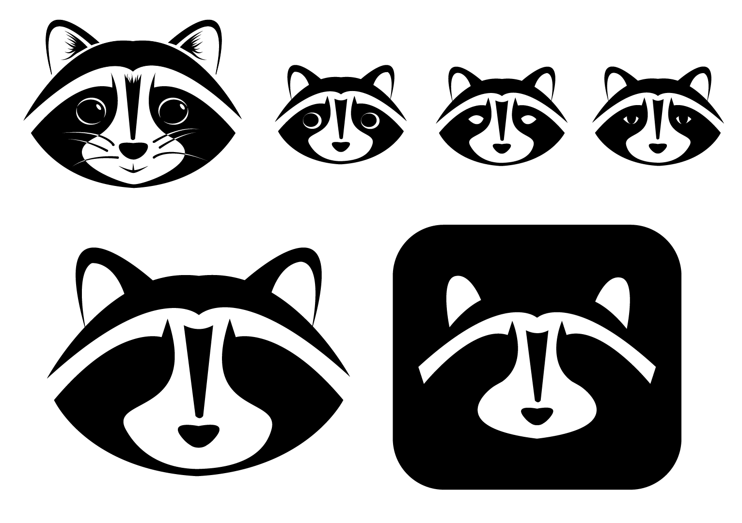
Focusing on the raccoon's face, I shifted from sketches to digital design, creating a scalable logo. Through iterations, I refined features like whiskers and fur, adjusting details for tone. I eventually removed the eyes to shift from a playful mascot to a serious, secure, tech-oriented identity.
CREATING THE COLOR PALETTE
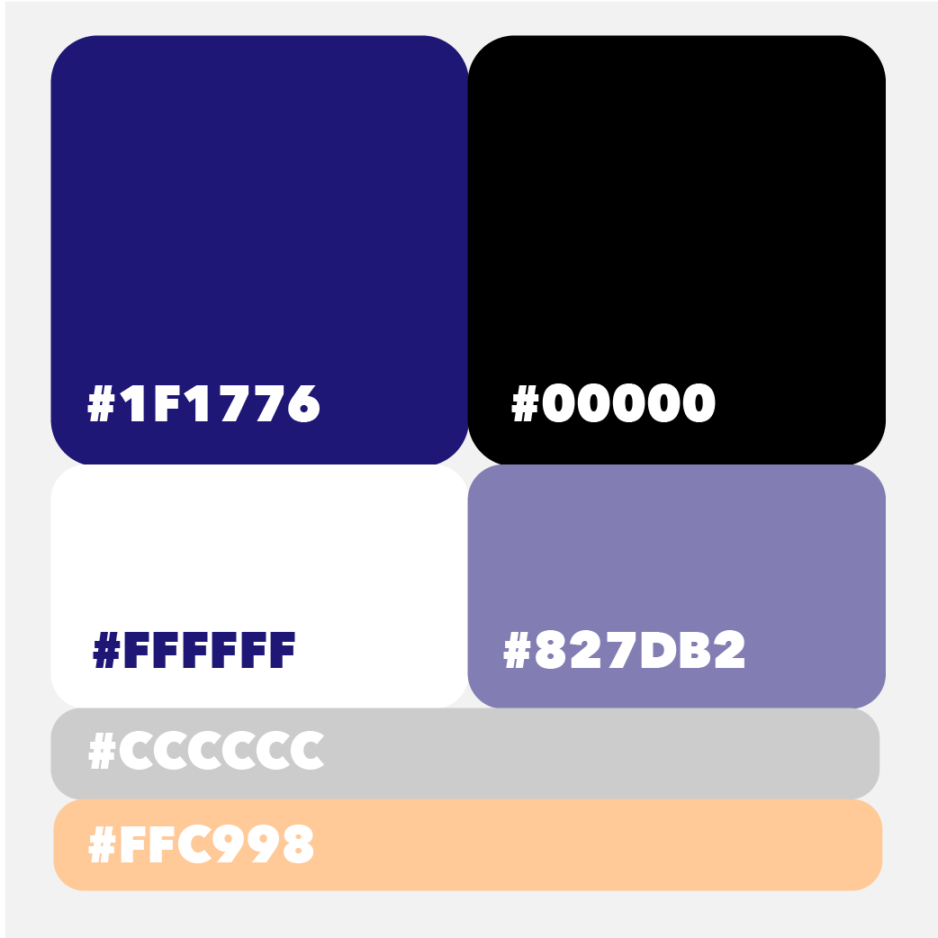
To bring the brand to life, I developed a color palette rooted in the raccoon’s natural hues. Black and white were prioritized for hierarchy and recognition, while a deep electric purple was introduced to reflect the tech-forward, nocturnal, and security-inspired qualities of the raccoon. To enhance versatility, I incorporated a lighter variation of the purple for buttons and specific applications, along with a soft creamsicle orange to provide a complementary pop of color.
Coming to life
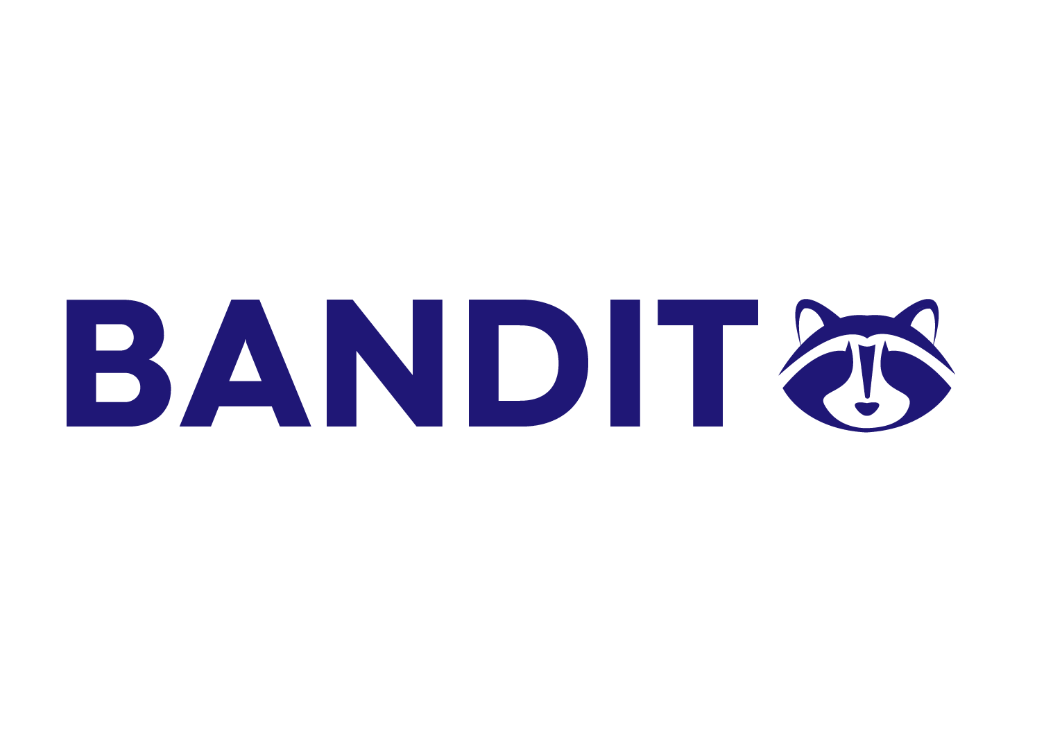
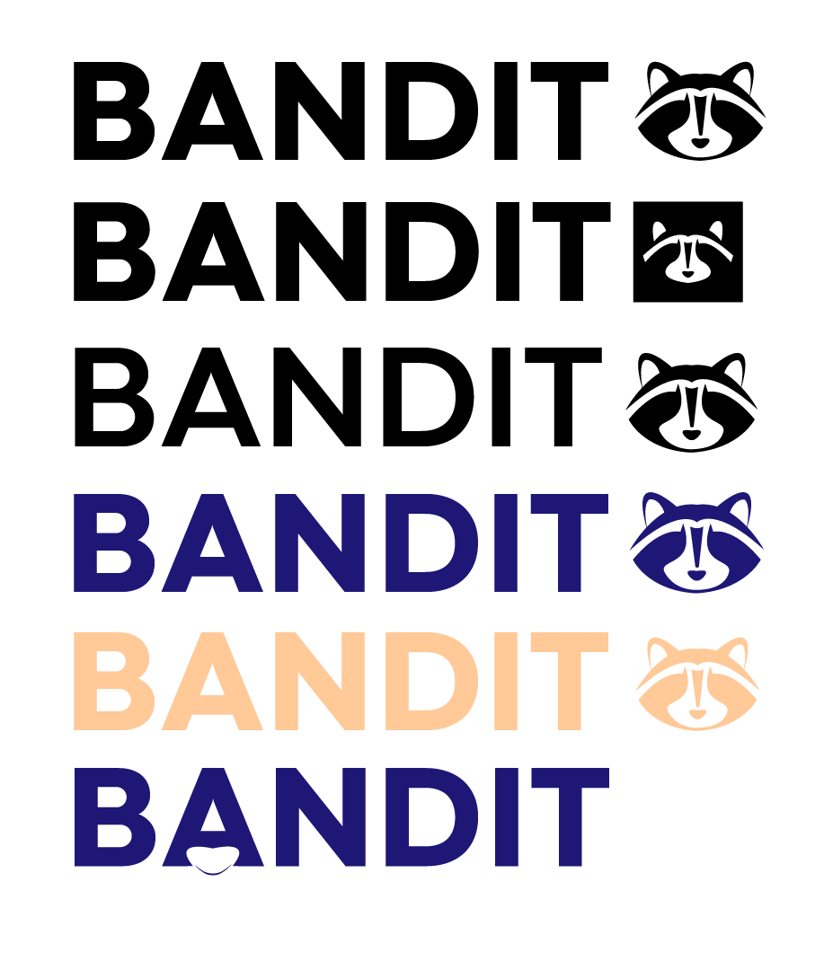
With the logo taking shape, I chose the name “Bandit” to pay homage to the raccoon’s iconic features. The name evokes themes of security, stealth, and nocturnal activity, perfectly aligning with the brand’s tone. From there, I began applying the color palette to explore how it interacted with the logo. I experimented with font pairings to find a balance between modernity and professionalism, testing variations of the logo across different contexts and levels of complexity to ensure scalability and adaptability.
mORE ITERATIONS AND STARTING ICONOGRAPHY
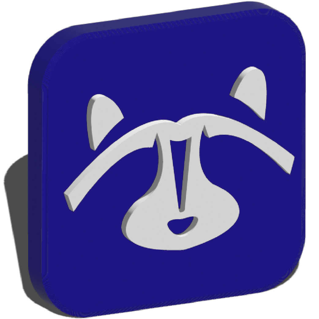
To expand the versatility of the brand, I created an alternative logo by transforming the raccoon’s nose stripe and nose into an exclamation point. This design pairs seamlessly with a lighter line-weight version of the main typeface, offering a scaled and adaptable logo option. Building on this iteration, I developed a series of app icons using the brand’s color palette and responsive logo variations, exploring how the design performs across different sizes and digital applications.
bringing it all together with mockups
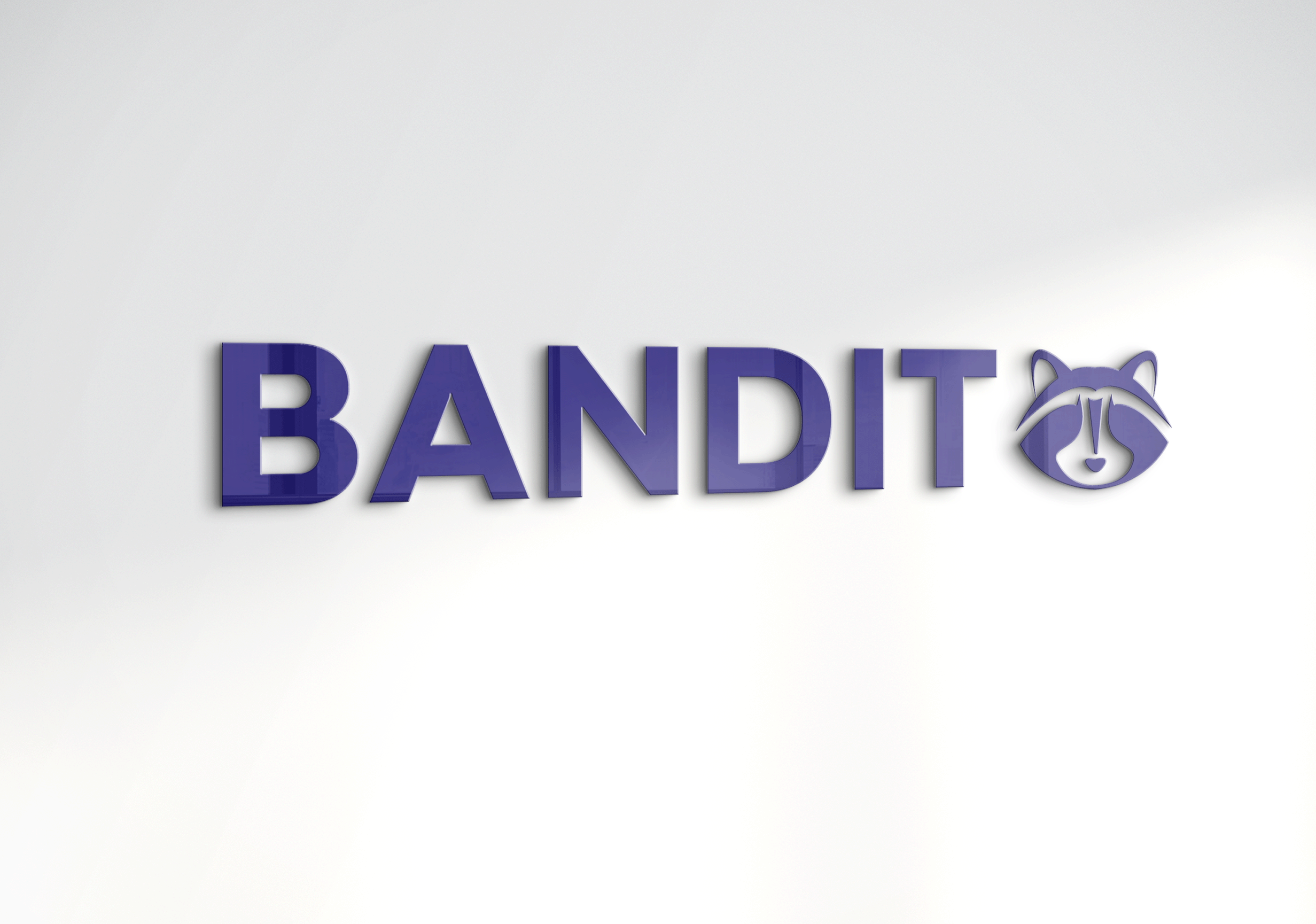
To complete the brand kit, I created mockups showcasing the logo’s scalability and usability across various applications. From digital interfaces to print materials, these mockups highlight how the logo and its variations perform in real-world contexts, emphasizing the adaptability and cohesion of the brand identity.
Final Takeaways
This project deepened my appreciation for brand design, as I explored how to translate abstract ideas into a cohesive identity. From sketching and logo creation to color theory and scalability, I honed my technical skills while learning the value of iteration and attention to detail.
