Website and Menu Redesign
I redesigned this local diner’s website to create a welcoming, user-friendly experience that reflects its family-owned charm. Drafted in Figma, the new design emphasizes accessibility with streamlined navigation, an intuitive menu display, and a clean, responsive layout. This update transforms their basic “blank page” into an inviting platform that strengthens connections with loyal customers and attracts new ones.
The diner
Tim’s Place, a cherished local diner that’s beloved by the community, exudes a warm family charm that draws in visitors from far and wide. I thoughtfully redesigned their website to beautifully capture its unique personality and significantly enhance the overall user experience, making it not only easier for customers to connect but also feel right at home, both online and offline.
Depicting the user base through proto-personas
In the proto-persona phase, I created 2 initial user personas to guide design decisions by identifying potential user needs, goals, and pain points. This understanding of the user base provided an outline of what the website needed to properly serve its customers, ensuring a user-centered design from the start.
Reviewing the initial website
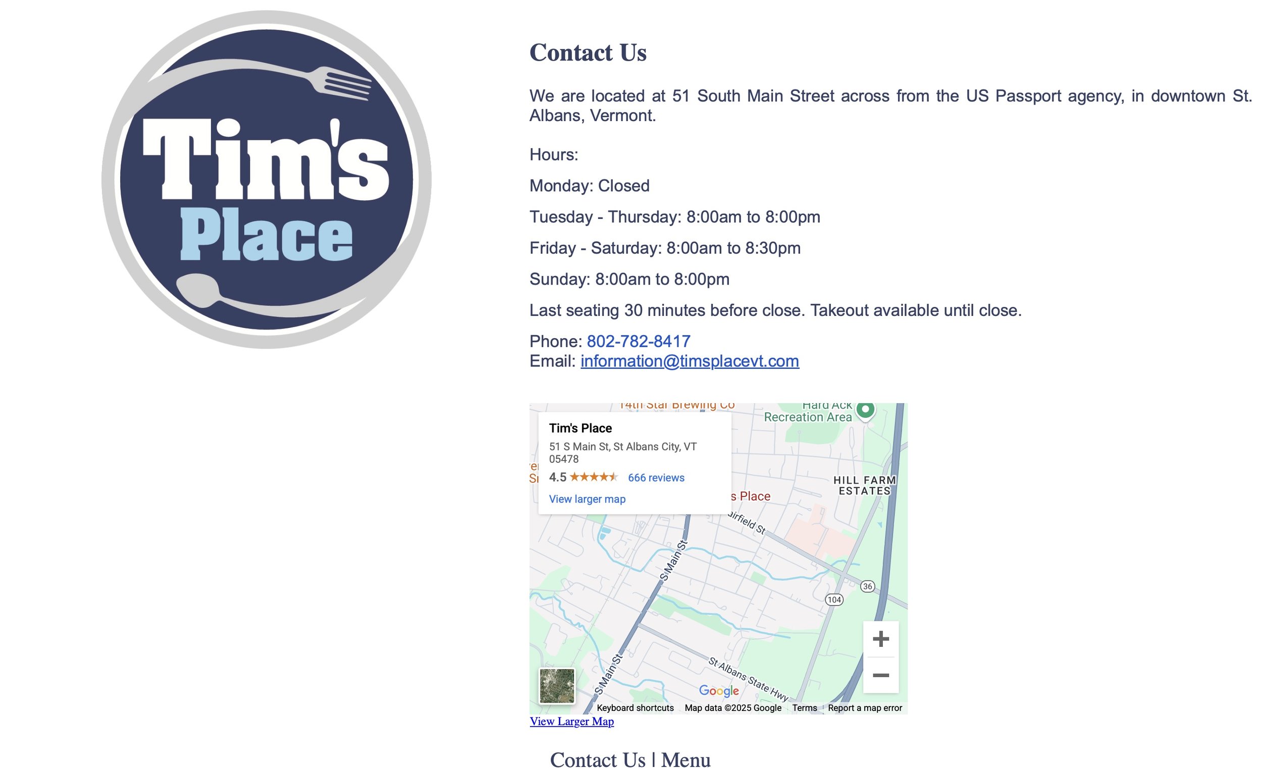
The initial website was a basic placeholder with a static logo PNG and links to contact info and a PDF menu. The contact page offered minimal details—hours, a pickup phone number, and a Google Maps link. The menu PDF was print-focused and hard to read online, highlighting the need for a more functional, user-friendly site to better serve customers.
Wireframes and Style Guides
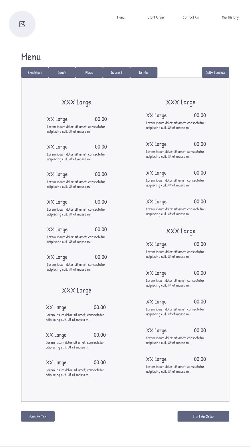
I created initial wireframes and blueprints for the website's navigation, ensuring a logical, user-friendly structure. To maintain consistency with the original brand identity, I developed a cohesive color palette and a basic style guide that reflected the diner’s established aesthetic.
“About us” Page
Menu Wireframe
Type Guide
Color palette
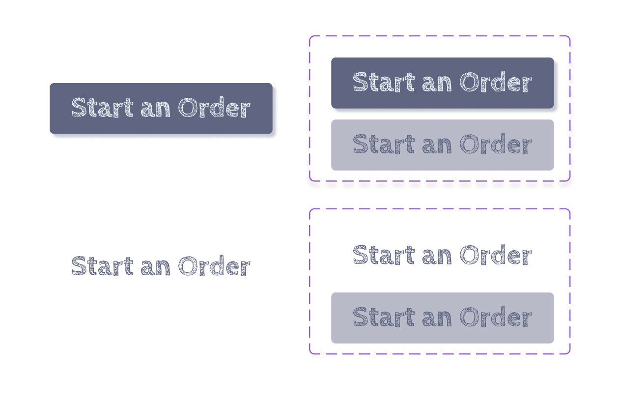
Sample Buttons
A strong landing page
A strong landing page is essential for making a memorable first impression. As a beloved household name, Tim’s Place is recognized for its iconic blue storefront, which I knew had to be part of its digital presence. To capture this, I hand-drew an outline sketch of the storefront, making it the centerpiece of the diner’s landing page and tying the design to its well-loved identity.
Menu Updates
The menus were redesigned to be digitally readable and easy to update, ensuring accessibility across devices while staying true to the brand’s identity. Each menu reflects Tim’s Place's personality through its cohesive color palette, friendly typography, and inviting style. To capture the personal, physical feel of in-person dining, the pages were styled with a tabbed layout resembling a filing cabinet, adding a tactile, familiar touch to the digital experience.
<— Go ahead—Give it a try!
Putting it all together
The final product is a fully interactive high-fidelity prototype designed to be easily developed into a functional website. It seamlessly links all pages to create an intuitive user experience while drawing in both new and loyal customers. To add a fun, engaging element, I incorporated hidden “easter eggs” throughout the site, encouraging users to explore and connect with the diner in a playful way. This prototype not only improves usability but also captures the warmth and charm that define Tim’s Place.
The full prototype is linked directly into the site page right here so feel free to explore and test out the final project!
Final Takeaways
This project allowed me to hone my skills in user-centered design, brand identity development, and creating functional, engaging digital experiences. From conducting user research and developing wireframes to designing interactive prototypes, I strengthened my ability to balance creativity with functionality. This assignment reinforced the importance of understanding a business's unique personality and user needs to craft a design that truly resonates.
